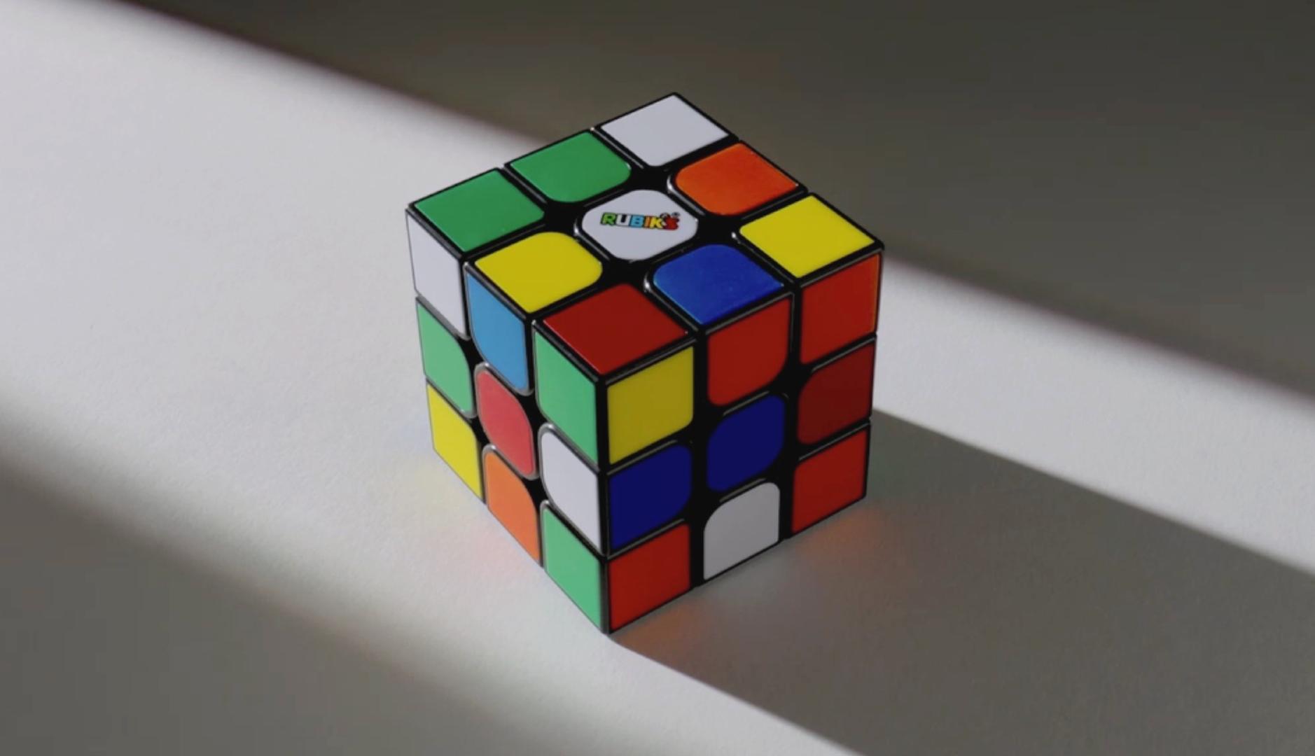
The Rubik’s cube is one of the most popular and recognizable toys worldwide. It was created in 1974 by Hungarian architect Ernő Rubik to help his students better understand spatial relationships and now, more than 50 years later, it has been recently redesigned to encourage a new generation of users to solve its puzzle.
The Rubik’s brand has revisited the design of the original 3×3 cube to offer a more fluid gaming experience with better sensory response, as explained on its website. The modifications are subtle, as the lens retains its iconic and colorful appearance, but the mechanism now allows for more agile and uniform turns and the finish features better corner cutting. Now the iconic toy has a more modern aesthetic thanks to a finer grid and a pleasant matte finish.
The most striking aspect of the update is not the aesthetics, which remain practically unchanged and based on its recognizable colors. The change focuses especially on the sensation it offers to touch to provide a more sophisticated experience to today’s audience, already familiar with a wide variety of dolls, toys and objects designed for sensory stimulation or combating stress.
In this regard, the brand’s intention has been to make the act of playing with the cube and solving it simple, fluid and satisfying. In this sense, we have sought to solve the friction of the previous mechanism, the alignment of the pieces to make the turns or the sharp corners of the cube. The focus has also been placed on the tension generated by the internal springs, which gave the object excessive rigidity.
Thus, as stated Fast Company, Rubik’s collaborated with manufacturers to test springs of different strengths, until they found ones that allow the cube to flex slightly without falling apart. Later, the shape of each piece was redesigned, rounding its edges so that now only the outer pieces retain sharp corners. A matte finish has also been applied to the outer pieces that prevents light reflections and provides better grip for your fingertips.
The intention of the redesign is to open the door to new consumers and build loyalty among those who already love the Rubik’s cube. Since the Canadian company Spin Master acquired Rubik’s in 2021, the company has expanded the original concept of the cube to other formats, such as the multiplayer game with *Rubik’s Rush* or the board game *Rubik’s Race*, seeking new audiences and gaming moments. And along these lines, according to the aforementioned media, they are also working on a collaboration with “Minecraft” to bring the puzzle closer to new generations.
“For me, this represents the essence of Rubik’s: the evolution towards a brand that goes beyond the classic 3×3 cube, becoming the cultural reference par excellence in the field of problem solving.“, commented George Scholey, Associate Brand Manager at Spin Master, to Fast Company. “Just as Lego is synonymous with construction, Rubik’s is synonymous with resolution”.
Thus, the brand aspires to conquer new spaces and continue to penetrate popular culture through innovations, collaborations and investment in the brand. Along with the redesign, the Rubik’s team has also renewed its website, which among other things now includes an eight-step guide to solving the cube, a questionnaire to help players discover their ideal solving style, or videos that explain each of these styles.
On the other hand, it has communicated the change by resorting mainly to social networks and collaboration with influencers and content creators in the games and entertainment category. All of them have valued the new design and experience of the cube, comparing it in practice with the previous model.