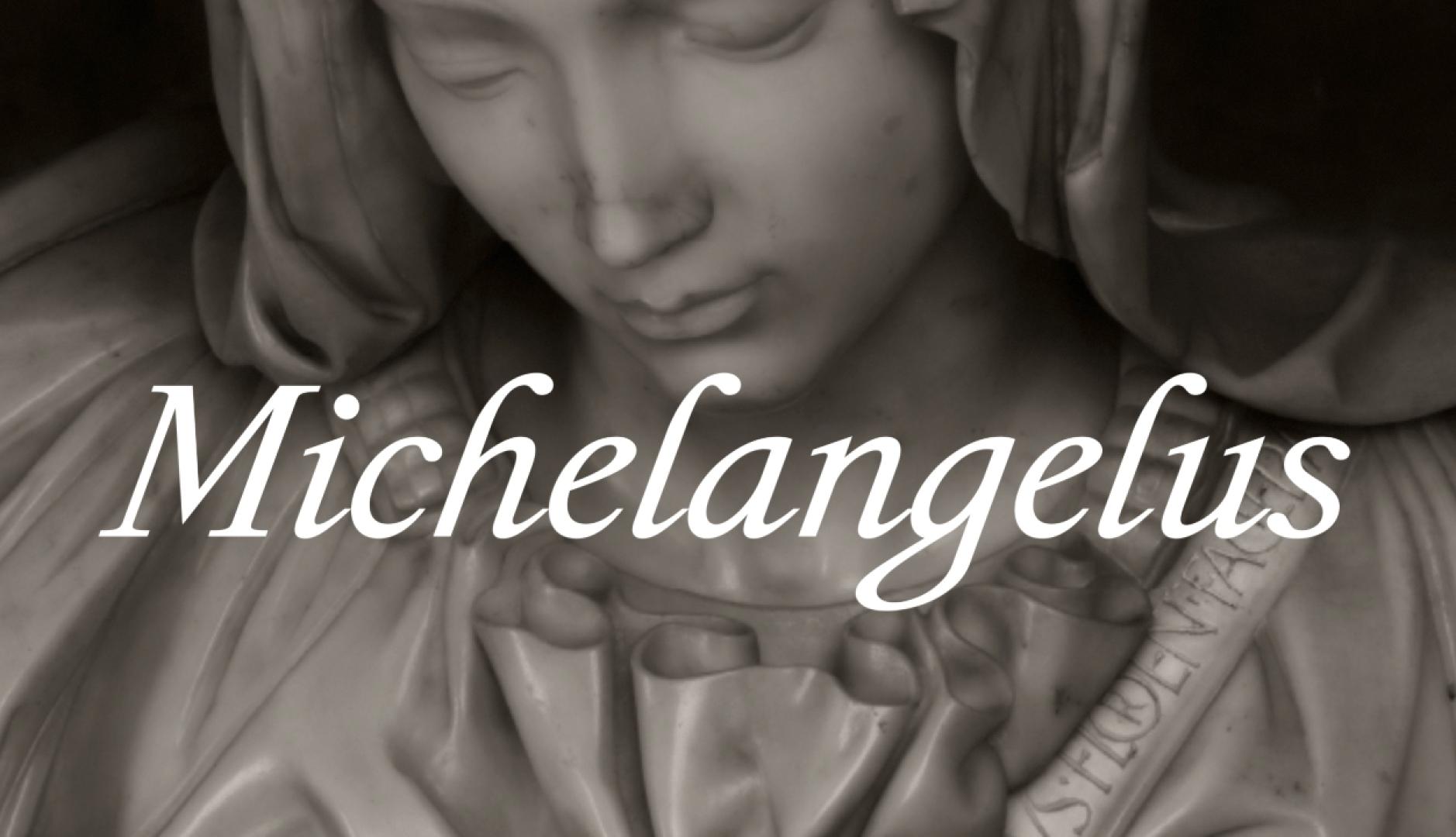
How would Michelangelo have designed a contemporary typography? This is the question that has guided the development of Michelangelus, a new typeface presented by Microsoft and inspired by the writing, proportions and visual language of the Italian artist. The project transfers elements of his manuscripts, his signature and the inscriptions present in some of his architectural and sculptural works to digital design.
The typography has been developed by the independent creative studio Studiogusto, with a presence in Italy and Germany, commissioned by the Fabbrica di San Pietro, the institution responsible for the conservation of St. Peter’s Basilica in the Vatican. Its creation is part of the commemoration of the 400th anniversary of the consecration of the basilica, whose famous dome was designed by Michelangelo.
Microsoft has collaborated with the Vatican on the legal aspects and on the technical and typographical review to ensure its incorporation into its products. Michelangelus is now available for download and will be coming to Microsoft 365 apps, including Word, PowerPoint, and Excel, later this year.
The font has more than 2,000 glyphs distributed in four styles: regular, italic, bold, and bold italic. Its design seeks to combine the characteristics of Renaissance writing with the legibility and versatility needs of a typeface intended for everyday use.
The main challenge of the project was to interpret the artist’s visual language without simply reproducing his calligraphy. To do this, the Studiogusto team had access to manuscripts and personal documents preserved in the Vatican archives, which they studied along with signatures, inscriptions and architectural elements.
“Our first decision, probably the most important, was not to emulate or perfectly imitate Michelangelo’s writing,” explains Stefano Caliandro, Founder and Creative Director of Studiogusto, in a Microsoft Design publication.
The starting point was cursive, an unusual decision in typographic design, where the regular version is usually developed first. The studio chose this approach because 16th-century writing was closely linked to slanted forms and the movement of the pen.
One of the characters that required the most work was the lowercase letter “g.” Its shape, directly inspired by the artist’s signature, required a week of adjustments to find the balance between historical reference and its adaptation to current uses.
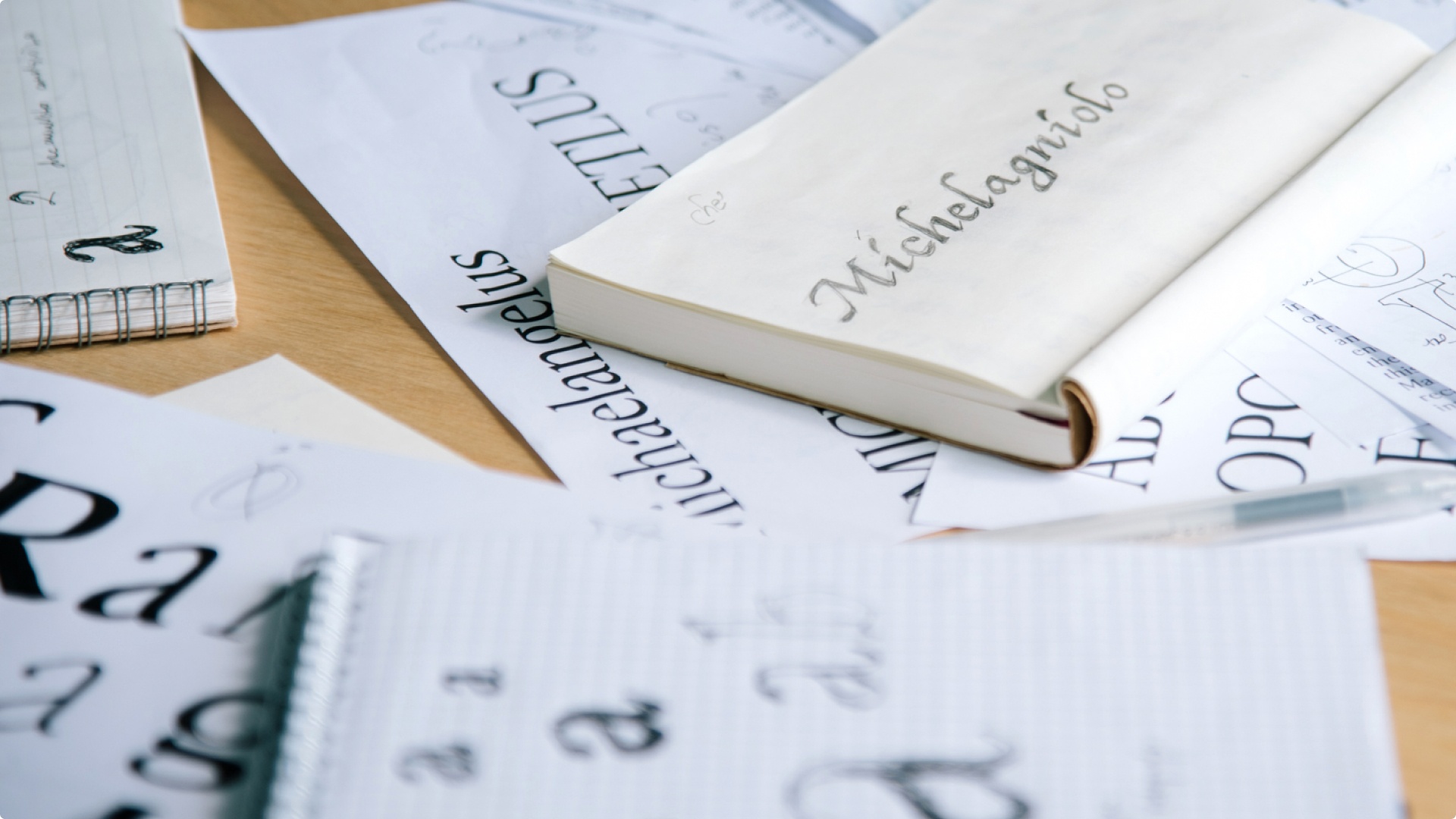
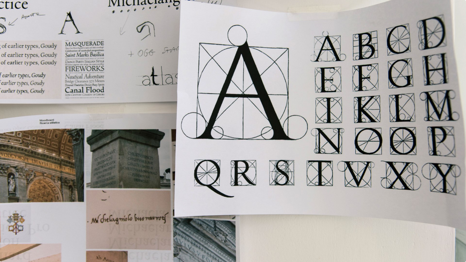
The designers also identified a peculiarity in Michelangelo’s writing: he deliberately separated the letters instead of linking them continuously. This characteristic provided clarity to his texts and revealed a structure based on proportions, spaces and repetitions. “What impressed us deeply was the presence of a hidden order,” Caliandro points out. The studio found in this organization a relationship with the artist’s architectural thinking, which served as a reference to build a coherent typographic system.
Michelangelo attached importance to both aesthetics and legibility
The investigation also included an anecdote collected in a letter that Michelangelo wrote to his nephew Lionardo. Annoyed by the difficulty in understanding his writing, the artist told him that he had thrown his letter into the fire and asked him not to write to him again until he improved his handwriting. For Studiogusto, the episode reflected the importance it placed on both aesthetics and readability.
The influence of sculpture and architecture on design
While the lowercase letters are mainly inspired by manuscripts, the uppercase letters take their reference from monumental inscriptions and shapes carved in stone. The team studied elements from St. Peter’s Basilica, the Sistine Chapel and the Pieta, whose band incorporates sculpted Roman letters. These references allowed characteristics such as the contrast between thick and thin strokes, broad curves and geometric proportions to be transferred to the alphabet.
The process also required interpreting characters for which there were no direct references. “We didn’t have a complete alphabet or a set of Michelangelo numbers. So we had to imagine what the missing characters could look like in a modern typography.”explains Alessandro Grandinetti, brand manager of the studio.
The result is a humanist-inspired serif typeface, with slightly narrow proportions that differentiate it from other classic families, such as Garamond. The endings of the letters retain references to the movement of the pen, while the capital letters incorporate features linked to geometry and sculpture.
With Michelangelus, Microsoft expands its typographic catalog through a project that connects artistic heritage, contemporary design and digital tools. The addition of the font to Microsoft 365 will allow the work, born from the research of documents and works preserved in the Vatican, to reach millions of users in their documents and presentations.
More info: Michelangelus